Friday, 11 March 2011

BIRDS

When looking for further inspiration, and after looking at various illustrative designs using paper I started to look at some of the photos I had taken whilst walking around Sheffield in search of primary research. One idea that remained in my head was to incorporate birds in my designs. And when visiting The Moor, the pictures below demonstrate why I decided to push the idea.

First of course, pigeons! There are quite often little flocks like this wondering around everywhere, I know most people hate pigeons, but I quite like the little guys.


Also at the moment on The Moor there is a mini exhibition set up by The Natural History Museum. The exhibition is a collection of stunning photos taken of wildlife from around the world, a number of these focusing on different species of bird. Below are a few photos taken on my mobile of some of the displays.


I've also included here an image of a Fishing Bat because the photo beautifully shows the different positions of flight.

I also purchased a few of the images on postcards from inside the shop, however the aspect of the exhibition that really inspired me to focus on birds was the hut itself.


Above we have the side of the hut and below the designs covering the windows.

I really like these designs, the way they focus on the silhouettes of each bird, but also the fact that the birds are in flight responds to the brief of creating a sculputure because it means they could be used as an airel or mobile design.


I also noticed inside the shop these pens designed using feathers like quills. I started to think about how I could use this sort of thing in my work.


Mr West


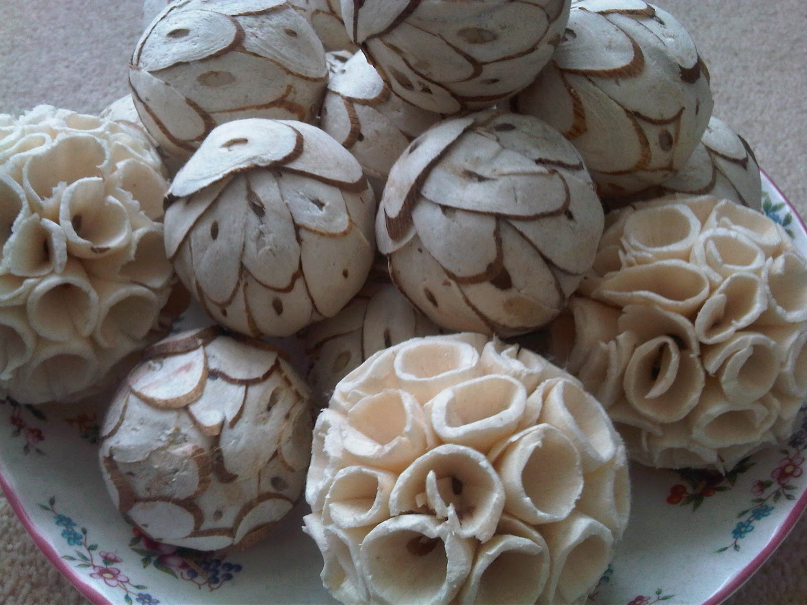
CONE BALL - primary research


Noticed this little creation in my mums home decor? Reminds me of sea life like coral or octopus tenticles. I decided to try to recreate a similar form with paper.


WORKSHOP 3

Really enjoyed our third workshop, this time learning a bit more about how to construct a 3D piece. Richard showed us how to use different shapes (in this case triangles) to attach together to create a 3D composition.
Inspired straight away I began creating the individual sections but I also wanted to incorporate further design so I began to cut into each piece much like I did with the last idea.


I continued creating the pieces at home and eventually I was left with my final spherical shape shown below. I attached the pieces together with staples which proved quite difficult due to the shape of the stapler and the the object and then hung it from my ceiling with a piece of thread.


I intend to photograph these again to emphasize the shadows created.

Here you can see my second attempt, this time I tried to create a larger scale more complicated design with diamond shape cut outs, however I didn't think it came out quite as impressive as I'd hoped. The second image shows the ball with either sides pushed in as if inverted, it gave the object a tyre like shape and the pressure that exerted on each piece due to changing its natural form, manipulated each individual section.


ZOE BRADLEY

After looking at shop window designs i came across designer Zoe Bradley and was very pleasantly surprised. Zoe's work specialises in paper design and structure and she uses her skills in a number of different and exciting ways. Below is a photo taken of a shop window she designed for Tiffany & Co. Along with a series of others like this, she created very delicate and fairytale like scenes using a combination of cut out pieces, layered and hung. I chose this picture as an example because I think the way she framed the overall image with the bare branches is very effective.


The second picture is a window designed for The White Company, using the pleated paper as an example of flowing fabric. This image seemed very relevant as the folded pages are reminiscent of the skills we used in our last workshop. It goes to show how something so simple as a few folds on a piece of a4 can come together to create such a complex design.

Further examples of Zoe's work. Love the paper roses in the second photo, and the overall design.
This image was taken of a window designed for a paper shop, how relevant.


The final images I've included from her portfolio are these editorial photos of headdress designs. The reason I think these are so effective is down to the fact that she's given the paper a fabric like appeal. Without knowing before hand that they are sculpted from paper, you could easily mistake them with a different softer material, taking away the crisp and rigid restraints paper provides.

Window Installations

After seeing the accessorize shop window I decided to try and research further to see if I could find any other examples of window designs using paper, and to my surprise I stumbled across a few brilliant examples.

Bergdorf Goodman Post-It Art


Here we have a shop window created for Bergorf Goodman in London which consists of a multitude of coloured post-it notes displayed to create an image of a famous face. Although it’s quite a simple and obvious concept, I think it’s really effective, and fits very well with the shop windows.


The Apifera window installation for Selfridges Store


The next brilliant example I came across was created by Matthew Plummer Fernandez for Selfridges London . His idea was centred around the idea of shops being plants, shoppers being bees and that the shop windows act as flowers to attract us. Taking inspiration from the science of attraction, he responded with complex fractional geometry to lure in customers. To read more about the technical side of this design you can read more here -  http://www.yatzer.com/1401_the_apifera_window_installation_by_matthew_plummer_fernandez


Another reason I found Matthews work so relevant is because to create his design he had to create the form out of paper first, creating 169 segments, folding and finding a way of joining them altogether.


Bit of window shopping like..


Back at home walking past the shop window of Monsoon in the Trafford Centre, I came across this beautifully crafted window design that started to get my creative juices flowing. I thought the use of structured petals and flowers mixed with the almost cut off approach worked really well and also created a divide between the front window and the rest of the shop.