Friday, 11 March 2011

Initial Poster Experimentation


After looking at Jen Stork's work I was inspired to experiment with coloured paper and simple shapes. I decided I wanted to keep the poster quite simple so as you can see, that's the vibe I was going for. I wanted the design to very obviously just look like cut out paper.


JEN STARK


I'm not normally overly interested in more abstract designs but I definitly enjoy looking at Jen Stark's work, and more than anything wonder how she even goes about creating such exciting and visually complex designs. The use of colour is an obvious attraction and definitly contributes massivly to the effect of each composition. I really like how simple the basis of each piece appears to be but the process of creating the outcome is hard to imagine. After only focusing on plain white paper or card so far I'm interested in purchasing some multicoloured pages to try and add new elements into my designs.

POP UP DESIGNS

100 Years of GFSmith Paper- General Outline

As the second half of the project focuses on creating a poster for GFSmith paper I began to do some initial research into the company I knew nothing about. After reading about the history of the company from family ties and blood lines to the difficulties the company has faced throughout its lifetime and throughout both wars, I definitly feel more interested and intune with the project. Learning that the company has survived even after suffering the fate of two wars and literally loosing everything, as the website puts it the buisness was at one point literally 'flattened', it gives a very strong visual image of flat paper and also the idea of a pop up, the company sinking to the ground and then building itself back up again.

IMAGES OF FINAL PIECE


Here are some photos I took of my final piece using the studio facilities at uni, I really like these four shots in particular. I really enjoyed trying to be creative with the light and adding my colour filters to capture the best shot.


BIRD BALL- creating my final piece

Developing on the work I've created so far I have decided to continue with the idea of ariel and sphere like sculptures. For my final sculpture I wanted to create a design that focuses on cutting into each piece, creating different images into each section. After researching into birds and realising the link between the nature of flying and creating a sculpture that hangs like a mobile I decided to go with the idea and chose a range of different bird silhouettes I would use.


spitting feathers


After looking at birds and deciding it would be nice to include them in my designs somehow I started experimenting with how this could be done. After looking at the photographs from The Natural History display but also at the feather pens inside the shop I decided to focus on the idea of using the feathers, so I started trying to figure out how I could create them out of paper.

First I cut out feather shapes, and cut into them creating the frayed edges, after that I cut appropriate sizes of thin wire and covered them in white paper. I could have done without the wire but I thought it would add a nice element because then I could mould the shape and structure of each feather.


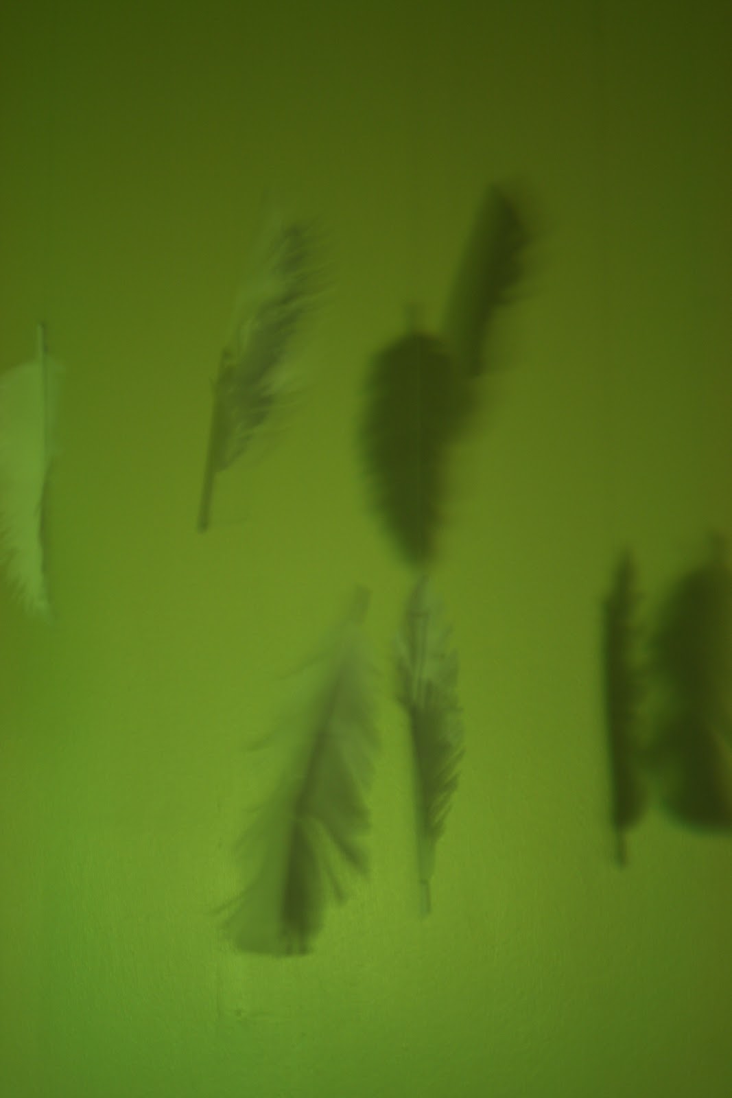
After I had created a few I decided to try and hang them to photograph to see how they would work as an ariel display. I wanted the feathers to look as though they were falling or caught in a gust of wind so I attacthed them at different points and and tried to stagger the angles of each one.


I'm really happy with how these photos came out, I think the photos where the light is behind the subjects rather than the front look more effective.

I also attempted to take a few photos demonstrating movement, the feathers falling in the wind. I do like the effect, especially how the shadows gave the effect of more feathers than there was, however the images are too blurry to be used.